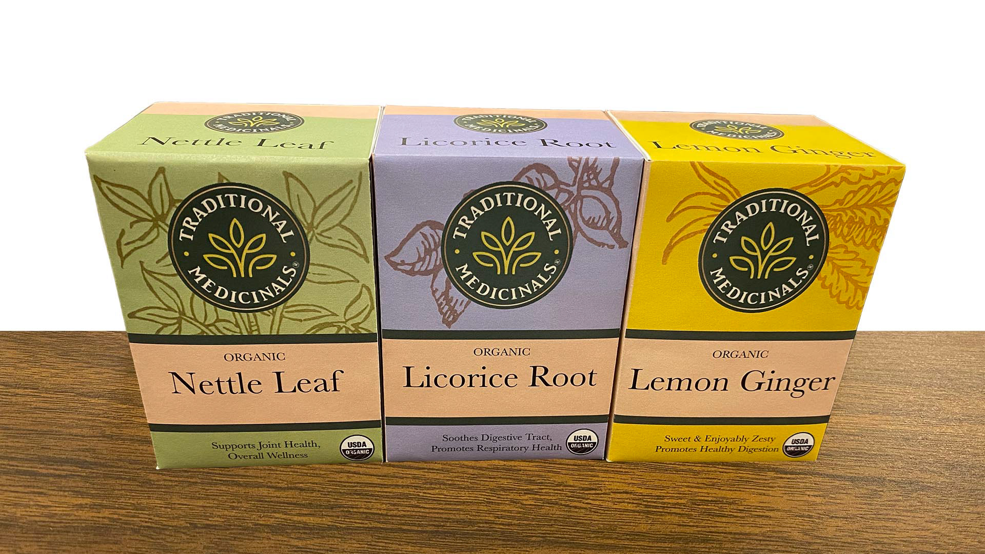
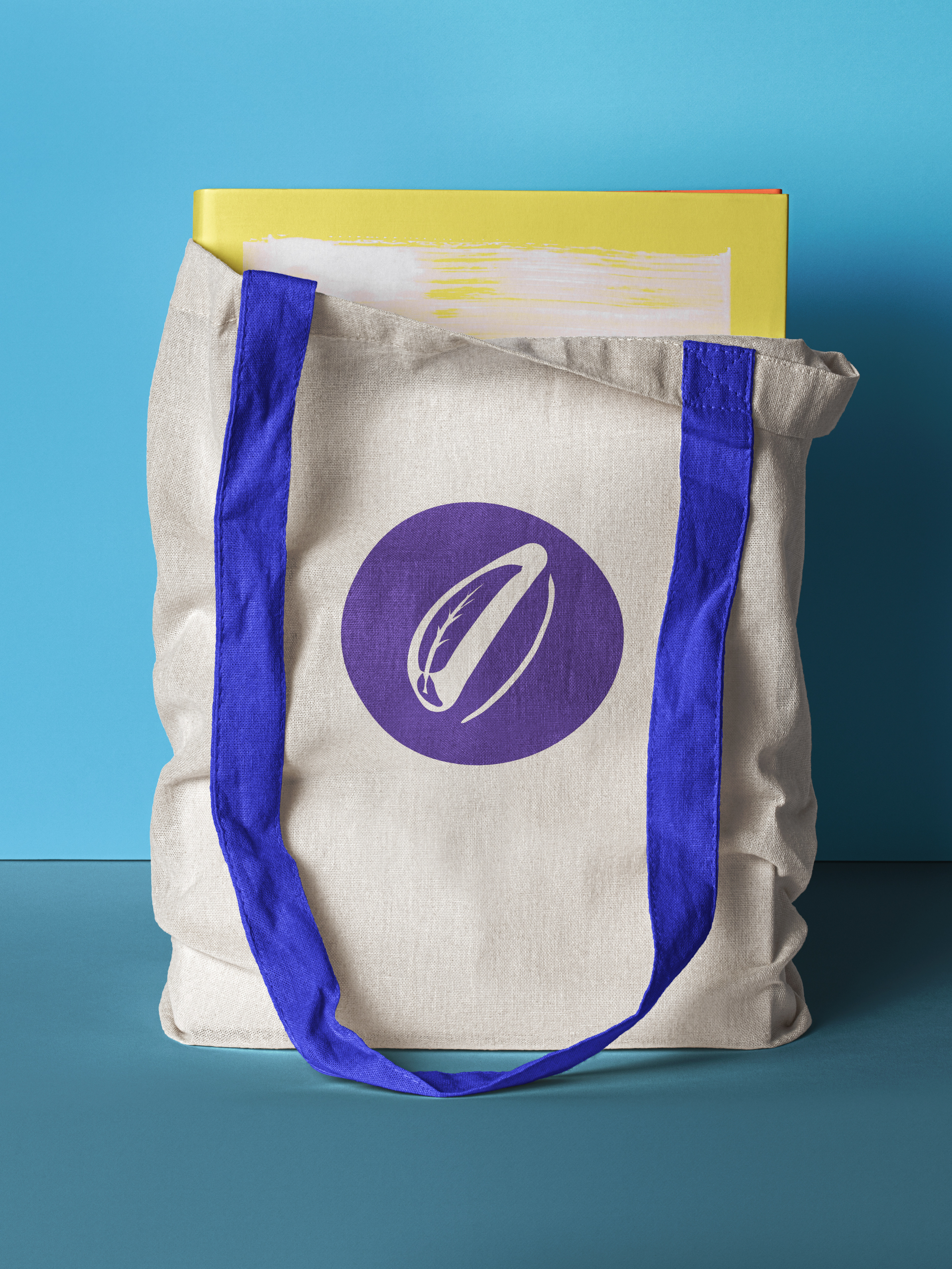
My goal here was to emphasize the home cooked side of traditional medicine. I replaced the busy imagery and outdated faux gold shine with a warmer, more personal and simple design.
For the illustrations, I turned to a book of Polish Traditional Cooking which features Polish woodcut prints from the 1850's. I chose a warm neutral as the unifying color. Paired with the dark green of the logo, it brings a sense of calm and cohesion across the various flavors of tea.
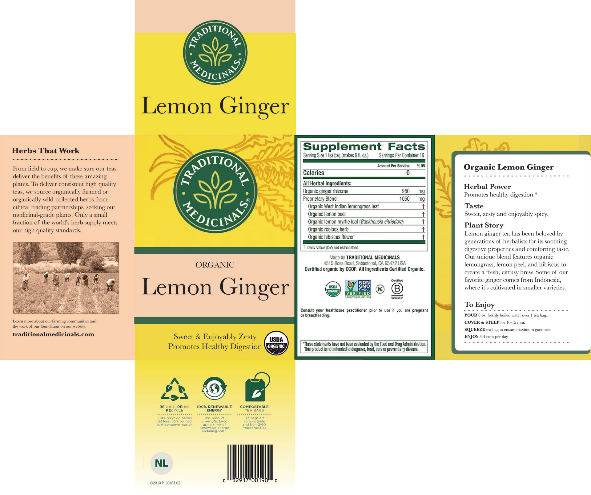
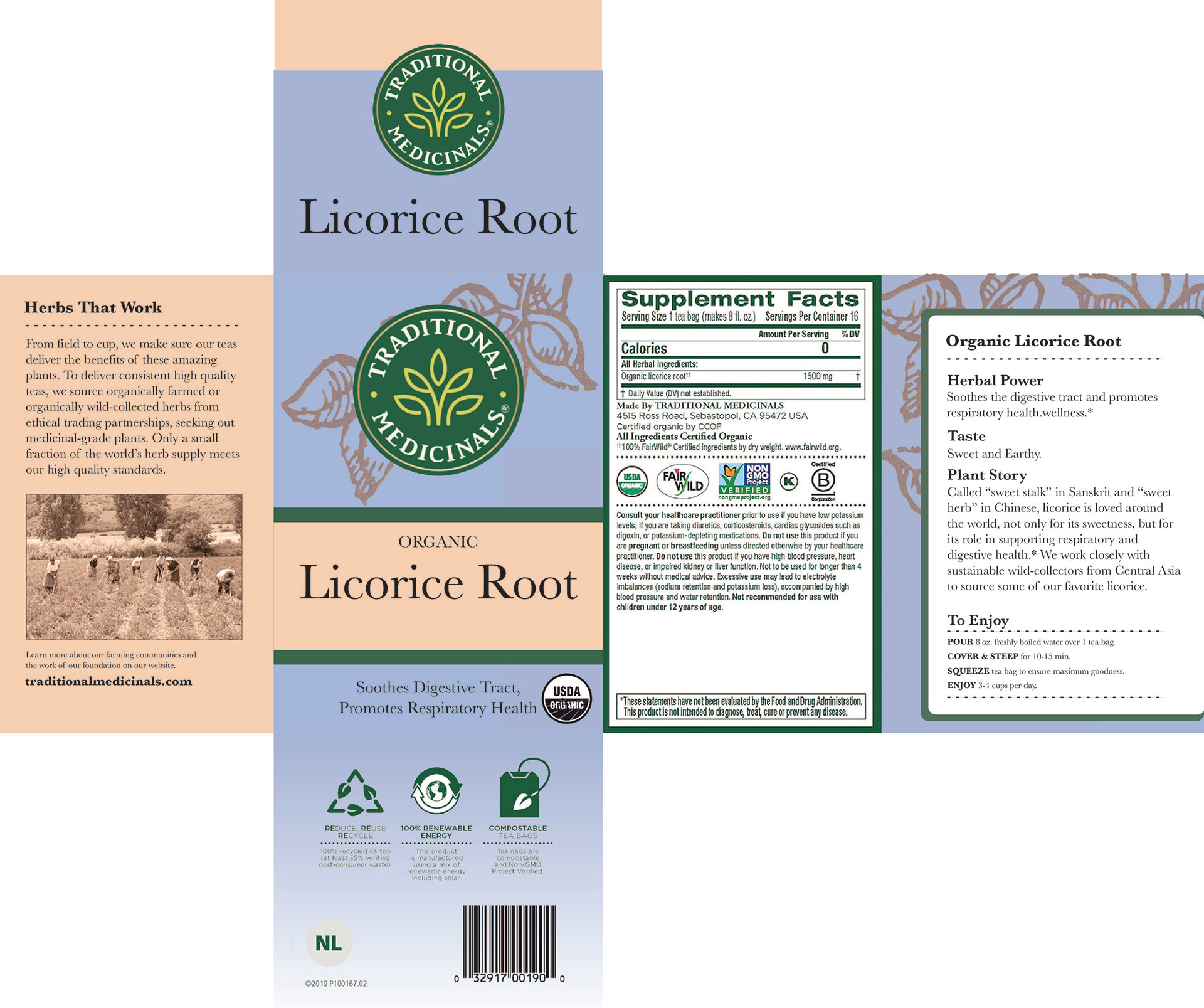
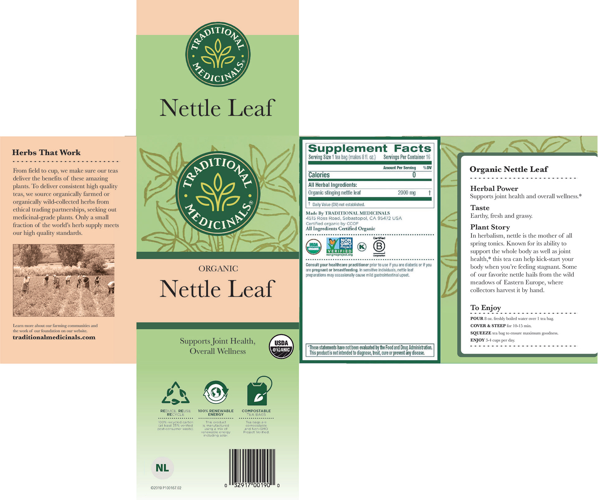
As part of this assignment, I printed and affixed the package redesign onto the original package.