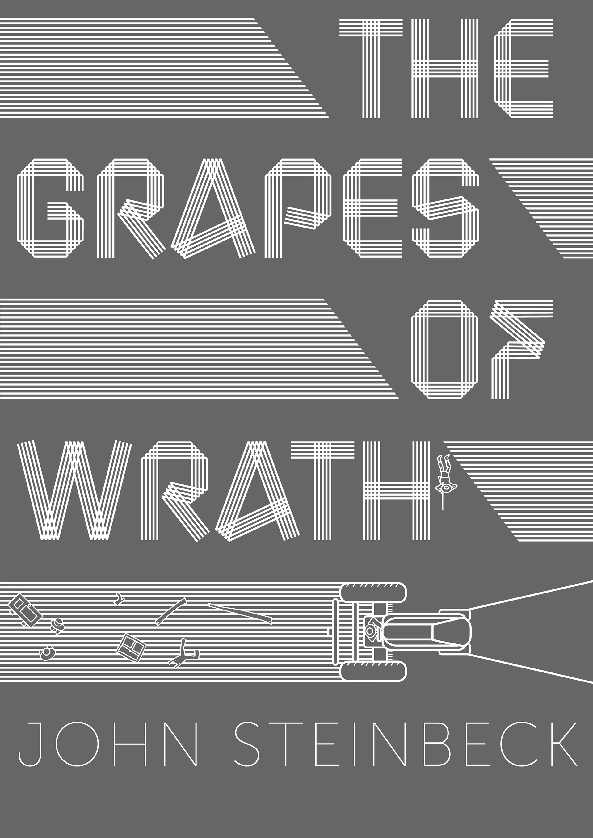
For this cover design, I chose to depict a bird's eye view of the instigating scene of the book, where the landlord sends a tractor to flatten all the dust bowl tenant farmer's homes.
The idea was sparked from the tractor driver's repeated phrase, "Can't break the line." I decided to explore the idea of a line as a destructive force.

After sketching five possible layouts, I decided that the fifth design had the most effective flow for the eye. I liked that the tractor became the focal point, and that the text became its path.
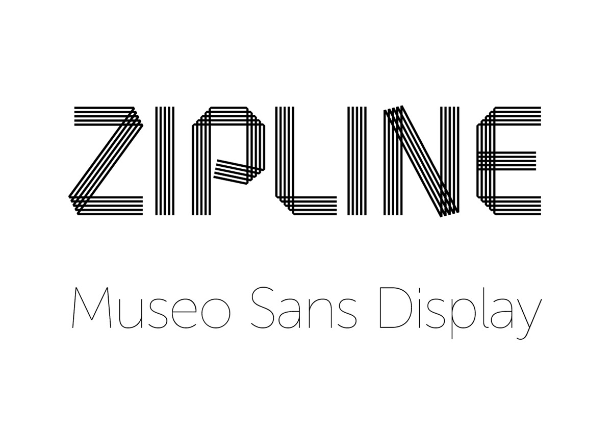
I chose the wonderful Zipline font because the letterforms look like recently plowed farmland. I built the entire design around this typeface.
I paired it with the Museo Sans Display typeface at hairline weight so that the author's name is composed of thin, clean lines, almost as if pulled from threads of Zipline's letterforms.